Destination: Philadelphia
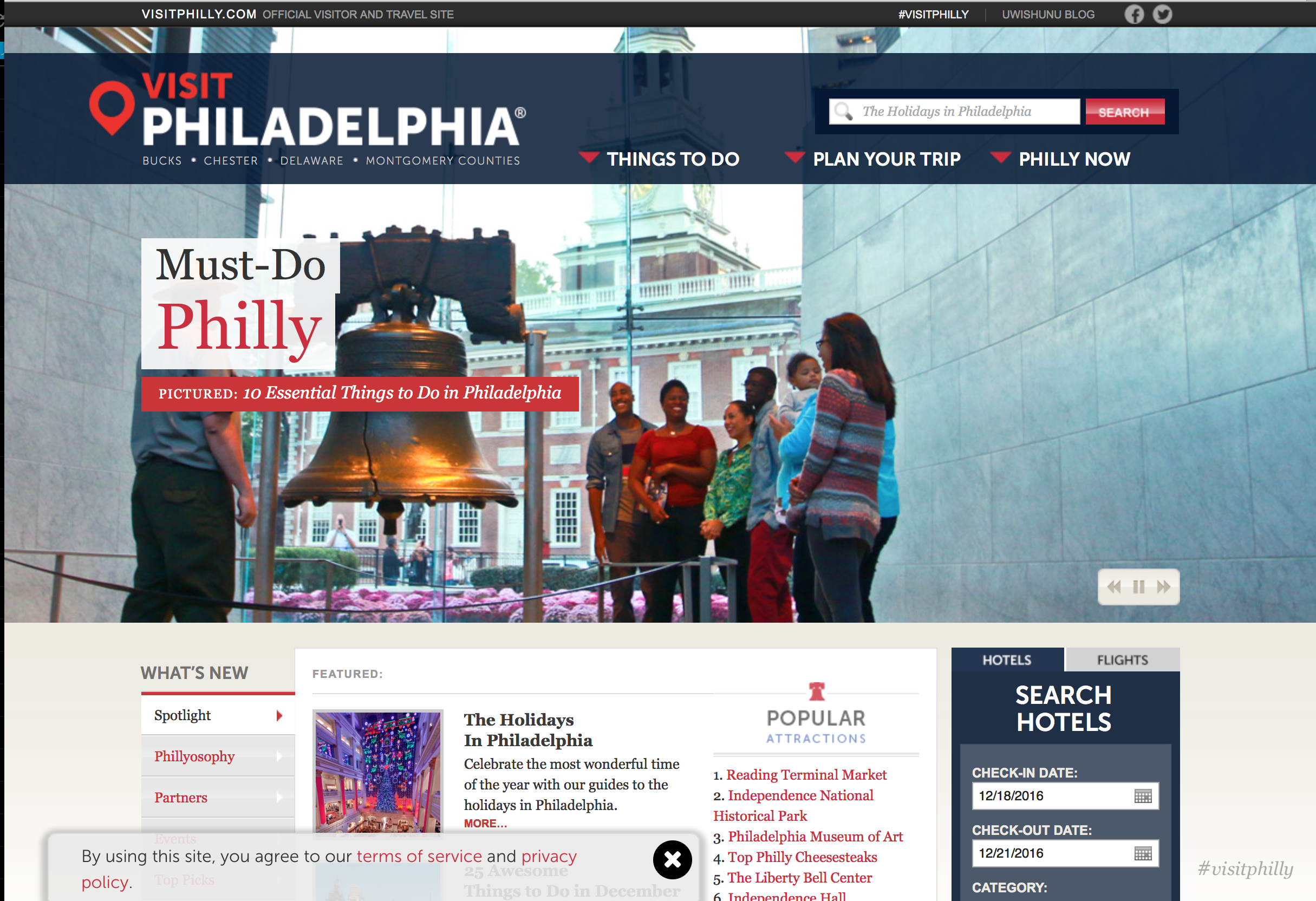
Overall, I think the Visit Philadelphia site does a great job of presenting pertinent and exciting information to potential visitors to Philadelphia. The carousel of images on the homepage immediately familiarize the visitor with some well-known Philly landmarks (Liberty Bell, the Zoo, etc.) The overall design of the site is clean, pretty user-friendly, and simple, but exciting.
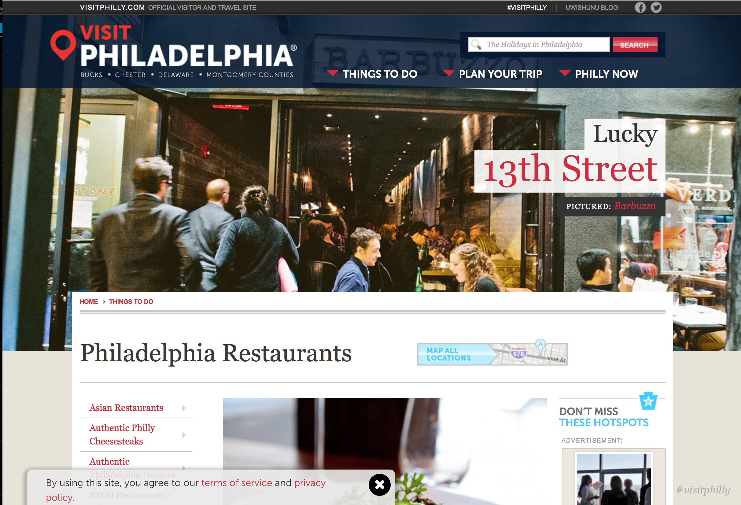
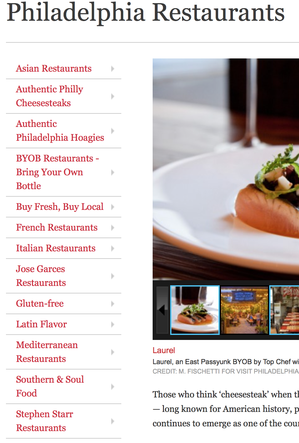
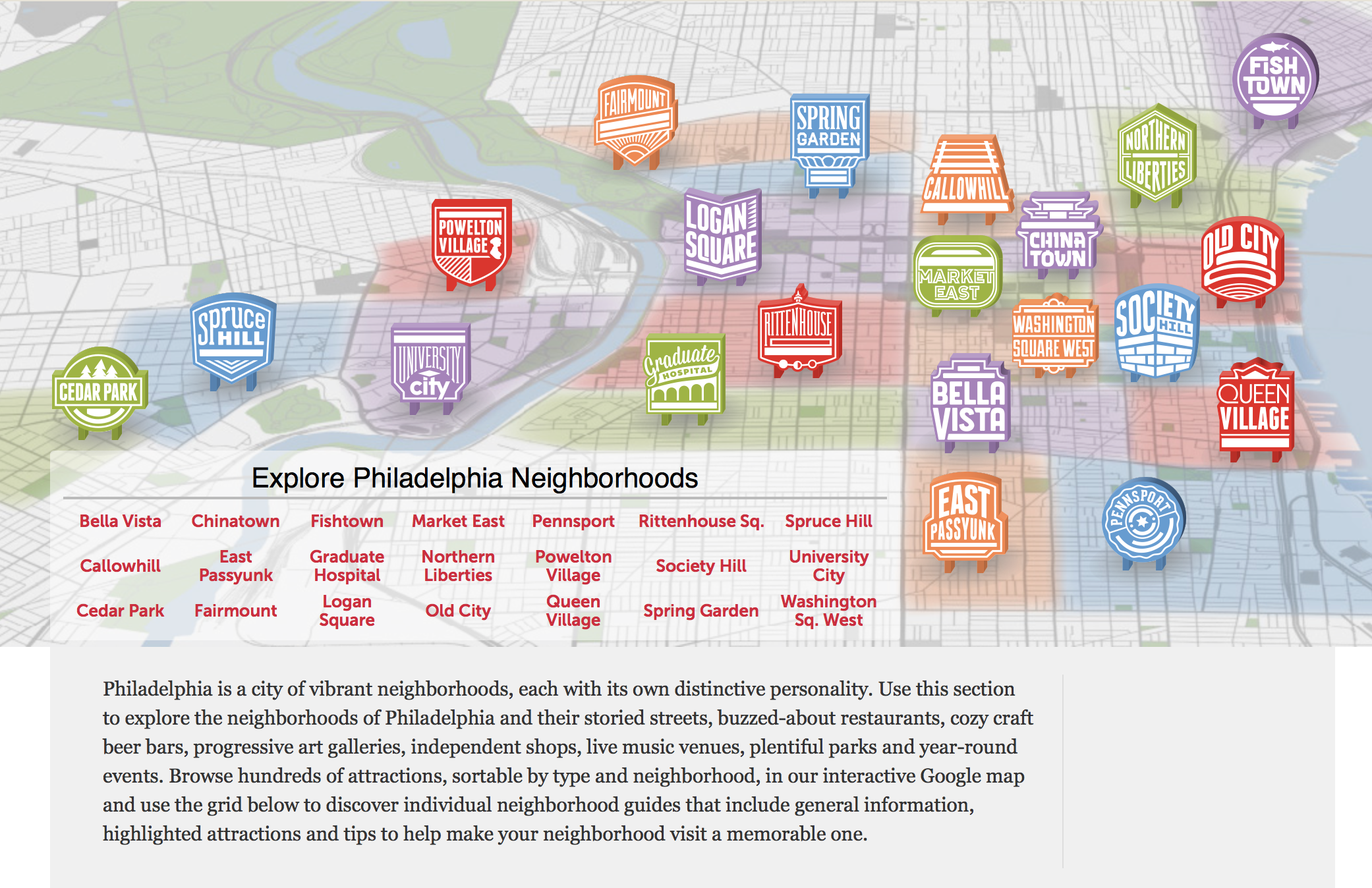
On some of the subsequent pages, the content has clear hierarchy and is reinforced through type size and placement. One of my favorite elements on the site is the semi-branded neighborhood pages. Each neighborhood feels special, and presents the feel/vibe of the neighborhood to a potential first-time visitor, through photographs, maps, and the mini badges/logos that place the neighborhood on the map.


