BEAUTIFUL PRINCIPLES OF DESIGN POSTERS.
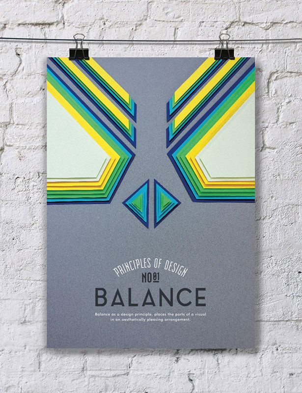
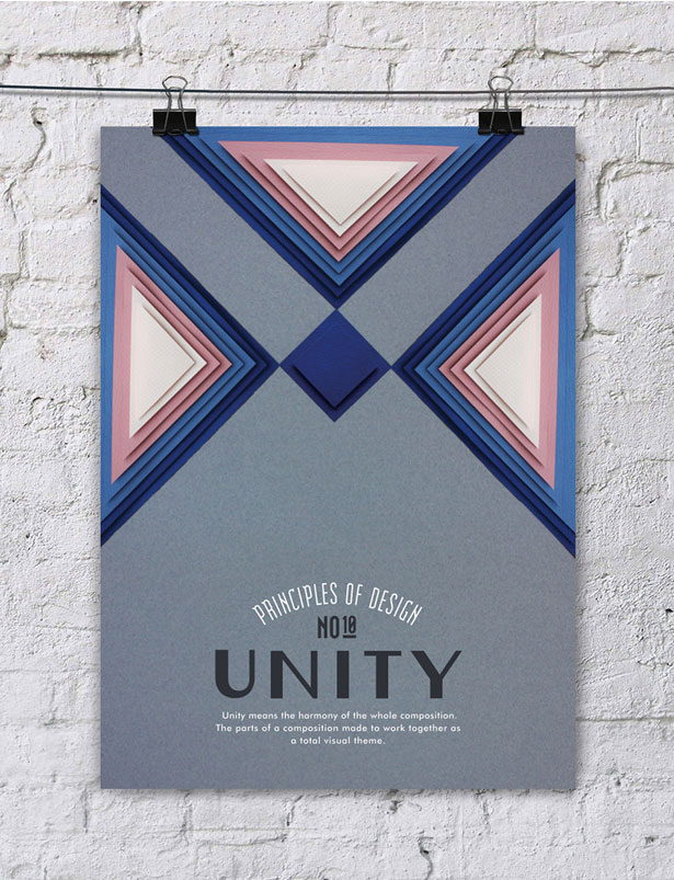
For a poster series illustrating ten principles of great design, these are - appropriately - beautifully designed. Otherwise it would have been a bit awkward.
Created by Turkish graphic designer Efil Türk using only paper cuttings, these explore the concepts of hierarchy, rhythm, balance, pattern, proportions, space, emphasis, contrast, movement and unity in stunning fashion.
Admire, and learn, below and visit Efil’s Behance page for more great work.
I love these posters so much. The posters are playful and really capture each of the principles. I’m drawn to the cut paper look, and admire Efil’s stunning craft.
My favorite posters are “Pattern” and “Emphasis”.


