Blog

Posts tagged book cover
tumblr_nhk1u4BaFm1rxtp97o2_1280.jpg
tumblr_nhk1u4BaFm1rxtp97o3_1280.jpg
tumblr_nhk1u4BaFm1rxtp97o9_1280.jpg
tumblr_nhk1u4BaFm1rxtp97o4_1280.jpg
tumblr_nhk1u4BaFm1rxtp97o1_400.jpg
tumblr_nhk1u4BaFm1rxtp97o6_1280.jpg
tumblr_nhk1u4BaFm1rxtp97o7_400.jpg
tumblr_nhk1u4BaFm1rxtp97o8_1280.jpg
tumblr_nhk1u4BaFm1rxtp97o5_1280.jpg

Best of 2014 (Movie posters / Album covers / Book covers)

Movie posters

  • Gone Girl: One of my most anticipated movies of 2014 was David Fincher’s adaption of Gillian Flynn’s thriller “Gone Girl”. As posters and production stills started being released, posters like this one not only spoke to Fincher’s signature style, but also a visual adaption of Flynn’s mysterious and haunting book. The cheeky/clever use of the text and it’s meaning work incredibly well as a teaser for the film. 
  • Inherent Vice: As of this post, I have not seen Inherent Vice, but the poster immediately grabbed my attention. The poster feels both referential of earlier decades and completely new and fresh. The design is playful, and the typography is elegant and purposeful. The composition is somewhat expected, but all of the pieces come together to create a memorable poster. 
  • The Hunger Games: Mockingjay Part 1: The Hunger Games movie franchise has always had some incredible creative direction and marketing rollout. While this isn’t the full movie poster, this teaser photograph/poster conveys so much interest and mystery in one image. The all-white photograph is haunting and makes the subjects look both statuesque and futuristic. 

Album covers

  • St. Vincent, St. VincentI’ve written about this album cover before here, but it’s still one of my favorites from the year (and one of my favorite albums.) St. Vincent’s bright, rich, and enigmatic sound is replicated with a simple, stirring, and (fake) minimalistic-inspired cover. The typography is weird and geometric, her pose is regal and elegant, and the severe contrast of colors work to make the cover visually stunning.
  • FKA twigs, LP1There’s something so unique, moving, and subtle about FKA twigs’ music, and this cover helps to communicate all of those things. Photographed and manipulated by artist Jesse Kanda, the bright, stirring, surreal cover is one that I think will be continually regarded as an important and “classic” album cover.
  • Tycho, Awake:  This minimalistic and restrained album cover is elegant in it’s simplicity. The range of colors and geometry convey the ambient and calming music that Tycho releases. 

Book covers

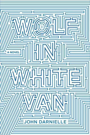
  • Wolf In White Van by John Darnielle: While almost headache-inducing, this weird, challenging, and maze of a book cover is really eye-catching. The two-color cover evokes a sense of mystery, curiosity, and confusion - all while being visually appealing and well-designed.
  • Your Face in Mine by Jess Row: I love this book cover for it’s simplicity, character, and elegance in it’s geometry. The abstracted geometric shapes come together to form an interesting shape (I see a geometric interpretation of an ampersand.) I particularly enjoy the change in typeface for the word “in” - it’s simple and almost goes by without notice, but everything comes together to form a simple, geometric, and pleasing cover.
  • The Silent History by Eli Horowitz, Kevin Moffett, Matthew Derby: This cover utilizes a clever typographic solution - a combination of geometric letters and blank spaces, with hand-written text set inside. The book is about a new generation of children who are born unable to understand language. It’s a dense topic, but the cover is deceptively simple and features some mystery in the combination of the set/written text. 
Books I Read in 2014
Goal: 14
Total: 32
Memoirs: 7 (Let’s Pretend This Never Happened, Medium Raw, I Don’t Know What You Know Me From, Heat, Joan Rivers: I Hate Everyone Starting With Me, My Horizontal Life, Not That Kind of Girl)
Books …

Books I Read in 2014

Goal: 14

Total: 32

Memoirs: 7 (Let’s Pretend This Never Happened, Medium Raw, I Don’t Know What You Know Me From, Heat, Joan Rivers: I Hate Everyone Starting With Me, My Horizontal Life, Not That Kind of Girl)

Books with left-justified type in the upper left corner: 4 (In The Woods, Tenth of December, Not That Kind of Girl, An Object of Beauty)

“Classics”: 6 (The Importance of Being Earnest, The Glass Menagerie, Of Mice and Men, Our Town, The Stranger, Frankenstein)

Books written by authors who aren’t white men: 17 (Let’s Pretend This Never Happened, Dark Places, This Is How You Lose Her, In The Woods, I Don’t Know What You Know Me From, Harry Potter 1-5, Tell The Wolves I’m Home, Joan Rivers: I Hate Everyone Starting With Me, Where’d You Go Bernadette?, My Horizontal Life, Sharp Objects, Not That Kind of Girl, Frankenstein)

Favorites: In The Woods, Mr. Penumbra’s 24 Hour Bookstore, An Object of Beauty

Favorite covers: This Is How You Lose Her, In The Woods, Where’d You Go Bernadette, An Object of Beauty

What are some books you would recommend?
bookcovrs:

Eiko Ojala

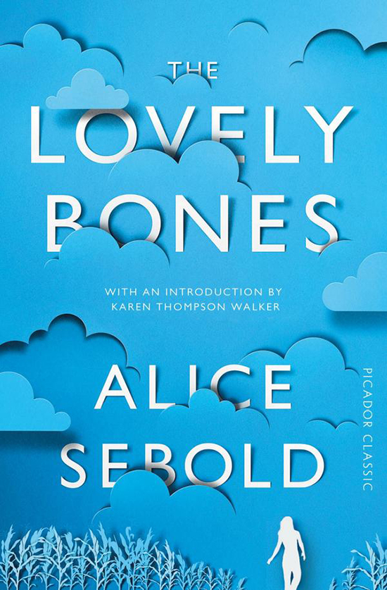
This cover for The Lovely Bones is a fantastic reimagining of the original cover from 12 years ago. I like the continuation of the same general color palette, and think the use of (simulated?) cut paper is extremely effective…

bookcovrs:

Eiko Ojala

This cover for The Lovely Bones is a fantastic reimagining of the original cover from 12 years ago. I like the continuation of the same general color palette, and think the use of (simulated?) cut paper is extremely effective and playful.  While I think the cover would probably work with just the cloud and text, I am happy the designer referenced the main character and a key plot location for the book.

I wonder if the cut paper is simulated or if it was cut by laser…..or even better, by hand!