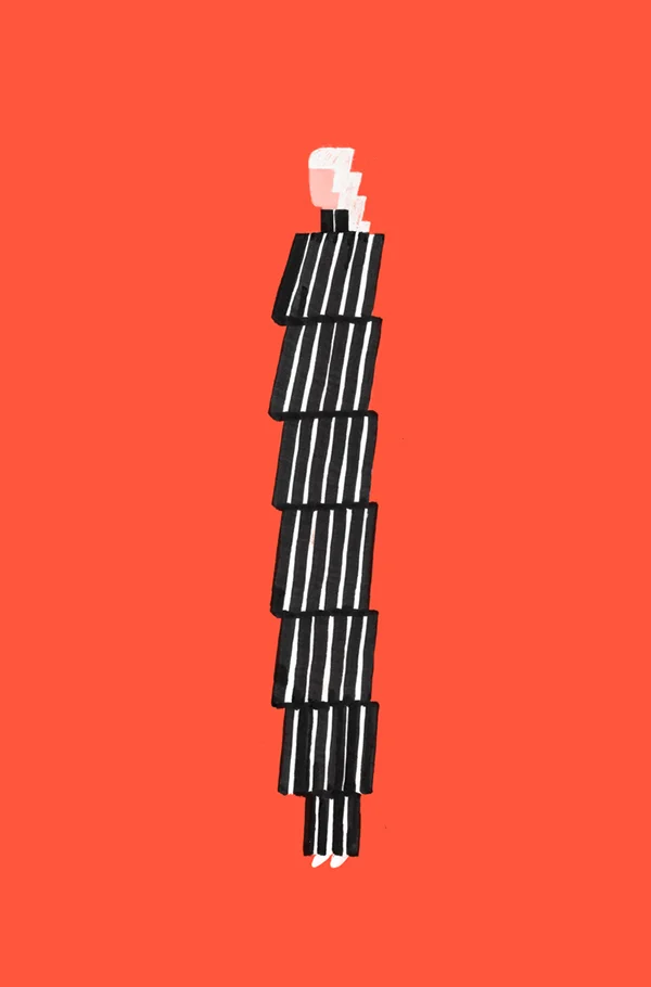
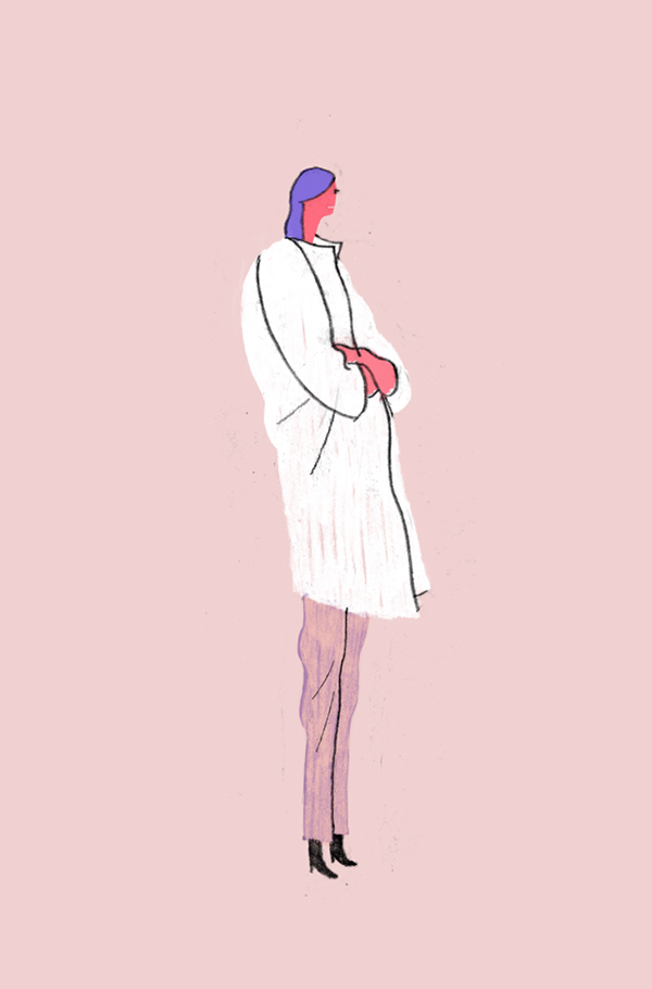
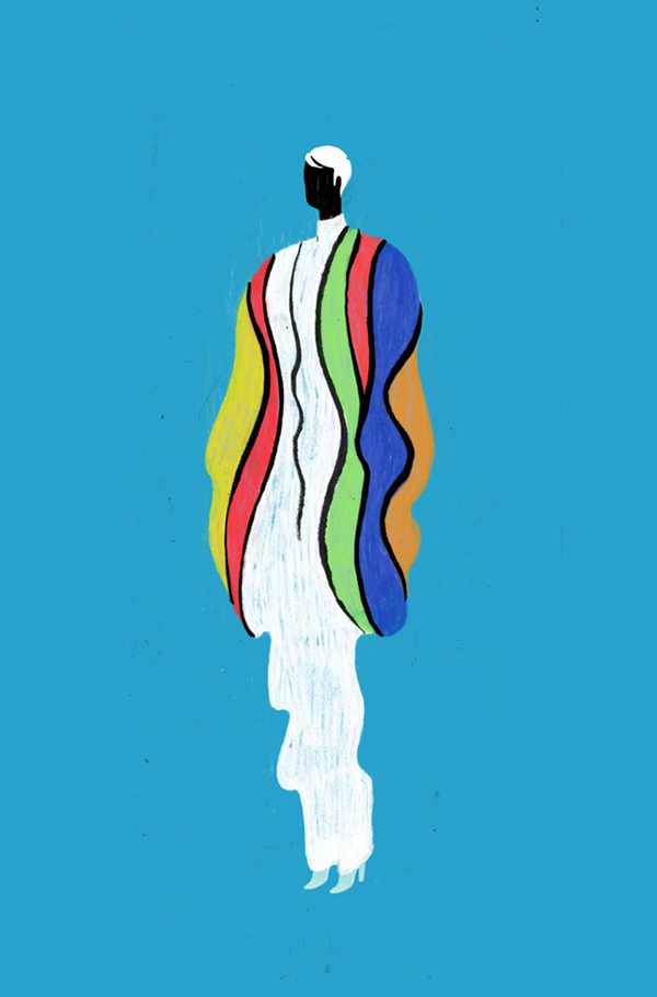
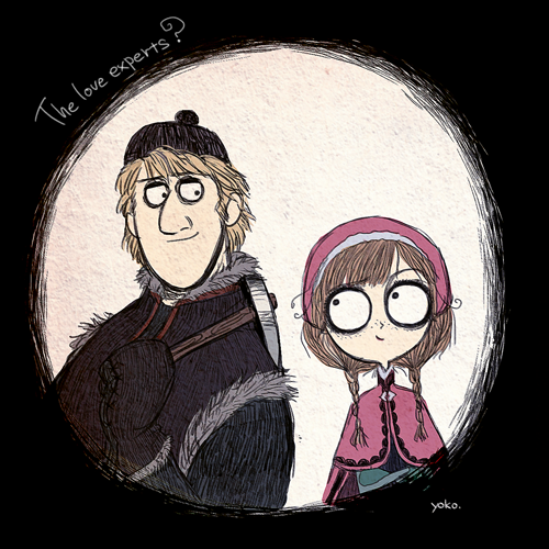
I am obsessed with these book covers. I LOVE the illustration style, the simplicity, and the use of color.
*stands* *claps*


I am obsessed with these book covers. I LOVE the illustration style, the simplicity, and the use of color.
*stands* *claps*


Chicago | August 2015
I visited Chicago for a long weekend in late August 2015 and absolutely fell in love with it’s architecture, people, food, and overall accessibility.
Here are some of my favorite shots from the trip! It’s an odd mix of everything I admired about Chicago: the eclectic mix of architecture, art & design styles; the inventive food; the welcoming people; and the beauty of the city at large.

So.my WBFF (work best friend forever) Erin has left our company and moved on to new & exciting adventures. Partly because I love making & writing cards for people, and because I needed a venue to write all of my silly, sappy, thankful, and nostalgic thoughts, I made this card for her.
She is leaving the office world behind and entering the fun world of specialty food, and I could not be happier or more excited (and a tinge jealous) of her.
The top three illustrations are of commonplace items/objects she encountered while here at the office, and the bottom three are just some of the many, many, many exciting items she will be writing about and styling/photographing (not jealous at all, promise ;P ).
I experimented with a new illustration style (for me) - using colored pencils and then adding detail, outlines, and shadow with a Micron pen. I will continue to pursue this style.

Type Exercise: 376


I was waiting in line at Starbucks last week and these stunning information cards caught my eye. Super funky patterns and foil stamping 👀👀👀.
They are information cards about a limited-run of Starbucks Reserve coffee, featuring coffee from around the world. There are six in total, each one completely different, unique, and reflective of the location.
My favorite (of these three) is the Brazil one. i enjoy the geometric elements and the overall simplicity of the card.
This video shows the process and collection of covers that were designed (and presumably pitched) for the new novel Hausfrau.
I love this! I could have continued to watch for another 10 minutes.


Best of 2014 (Movie posters / Album covers / Book covers)
Movie posters
Album covers
Book covers
At The New Yorker’s Midtown offices, a wall of covers arranged in chronological order shows a distinct change in tone. Today, the magazine’s covers, which have been drawn or painted by artists each week since its founding in 1925, frequently reflect, or subvert, the news.
The turning point is around Sept. 11, 2001, Mr. Remnick said, when The New Yorker ran a black cover with a black silhouette of the twin towers, by the Pulitzer Prize-winning artist Art Spiegelman, who has long collaborated with his wife and the magazine’s art editor, Françoise Mouly.
A great article about magazine cover design, illustration, and process.
Eiko Ojala
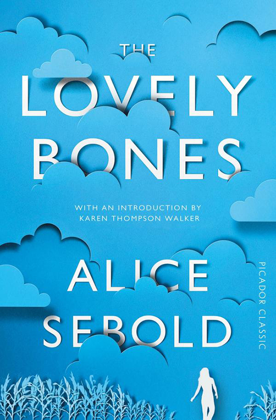
This cover for The Lovely Bones is a fantastic reimagining of the original cover from 12 years ago. I like the continuation of the same general color palette, and think the use of (simulated?) cut paper is extremely effective and playful. While I think the cover would probably work with just the cloud and text, I am happy the designer referenced the main character and a key plot location for the book.
I wonder if the cut paper is simulated or if it was cut by laser…..or even better, by hand!


Album Art / CD Cover Designs
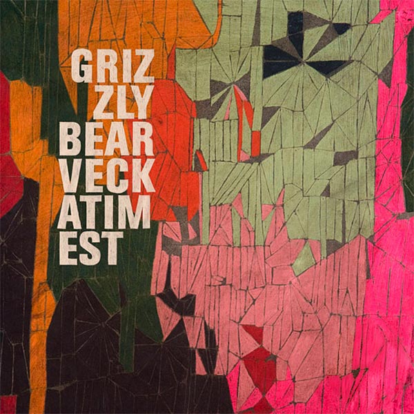
In choosing these 10 album covers, I tried to select 10 that would ultimately catch my eye if I saw them in a store or advertised online or in person. Many of the covers feature photography and typography working simultaneously to create one final composition. In these covers, I wanted examples of the typography adding to the cover, and not looking like an afterthought.
With the more experimental and illustrative covers, I tried to select different styles - all which feel very appropriate to the tone/genre of the music. With the Grizzly Bear and the Shins albums in particular, the illustration styles are geometric and experimental. These two album covers also utilize the famous rule-of-thirds.
Björk always manages to produce absolutely vivid, striking, and bizarre covers that often come off looking as if they belong in a high-fashion editorial magazine. For some other examples of her artwork, click here and here.

Mario Zucca | Here’s to 2013! (via Beutler Ink)
This is fantastic. So much fun to look around and see what you can identify. The illustration style is pretty cool, too.
For more information, and what’s included in the illustration, click here.

Good Luck
Hand-drawn typography, scanned and not cleaned up.

Handmade Thank You Notes
I made some homemade collaged thank you notes for some of my family members who helped make this past birthday special.
I wanted each card to be unique and have a different style/aesthetic to them. Collages were made from assorted magazines.
Plus, who doesn’t love snail mail? I’m a huge proponent of actually hand-writing thank you notes. It goes a lot farther than you might think. Send a thank you note this holiday season. It won;t go unnoticed.

A random doodle/sketch that I (quickly) digitally colored.

Illustrated Quote Poster | Source