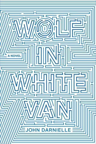
I am obsessed with these book covers. I LOVE the illustration style, the simplicity, and the use of color.
*stands* *claps*

I am obsessed with these book covers. I LOVE the illustration style, the simplicity, and the use of color.
*stands* *claps*


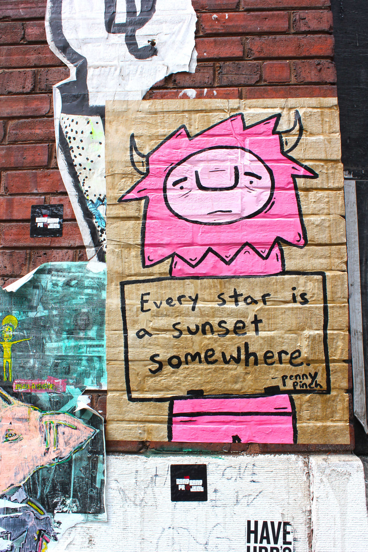


Chicago | August 2015
I visited Chicago for a long weekend in late August 2015 and absolutely fell in love with it’s architecture, people, food, and overall accessibility.
Here are some of my favorite shots from the trip! It’s an odd mix of everything I admired about Chicago: the eclectic mix of architecture, art & design styles; the inventive food; the welcoming people; and the beauty of the city at large.
One of my biggest passions and hobbies is food. I love to cook and check out new, interesting, or unique restaurants. After living in Philadelphia for a number of years and always feeling a little out-of-the-loop in terms of the restaurant scene, I (finally… I mean, really late to the game on this one) found Foobooz, Philadelphia Magazine’s restaurant news & reviews blog. I read Foobooz very frequently, excited to see what new restaurants are opening, which chef’s are tackling new projects, and what a critic REALLY hated at the new/trendy spot. Even if I’ve been to a restaurant before, I typically still head to Foobooz to see what they have to say.

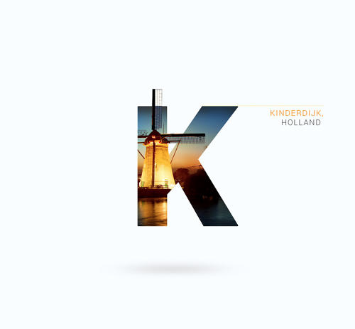

These are stunning. Super simple, elegant, and sharp.
Favorite letters: C, H, O, R

So.my WBFF (work best friend forever) Erin has left our company and moved on to new & exciting adventures. Partly because I love making & writing cards for people, and because I needed a venue to write all of my silly, sappy, thankful, and nostalgic thoughts, I made this card for her.
She is leaving the office world behind and entering the fun world of specialty food, and I could not be happier or more excited (and a tinge jealous) of her.
The top three illustrations are of commonplace items/objects she encountered while here at the office, and the bottom three are just some of the many, many, many exciting items she will be writing about and styling/photographing (not jealous at all, promise ;P ).
I experimented with a new illustration style (for me) - using colored pencils and then adding detail, outlines, and shadow with a Micron pen. I will continue to pursue this style.

Type Exercise: 376


I was waiting in line at Starbucks last week and these stunning information cards caught my eye. Super funky patterns and foil stamping 👀👀👀.
They are information cards about a limited-run of Starbucks Reserve coffee, featuring coffee from around the world. There are six in total, each one completely different, unique, and reflective of the location.
My favorite (of these three) is the Brazil one. i enjoy the geometric elements and the overall simplicity of the card.
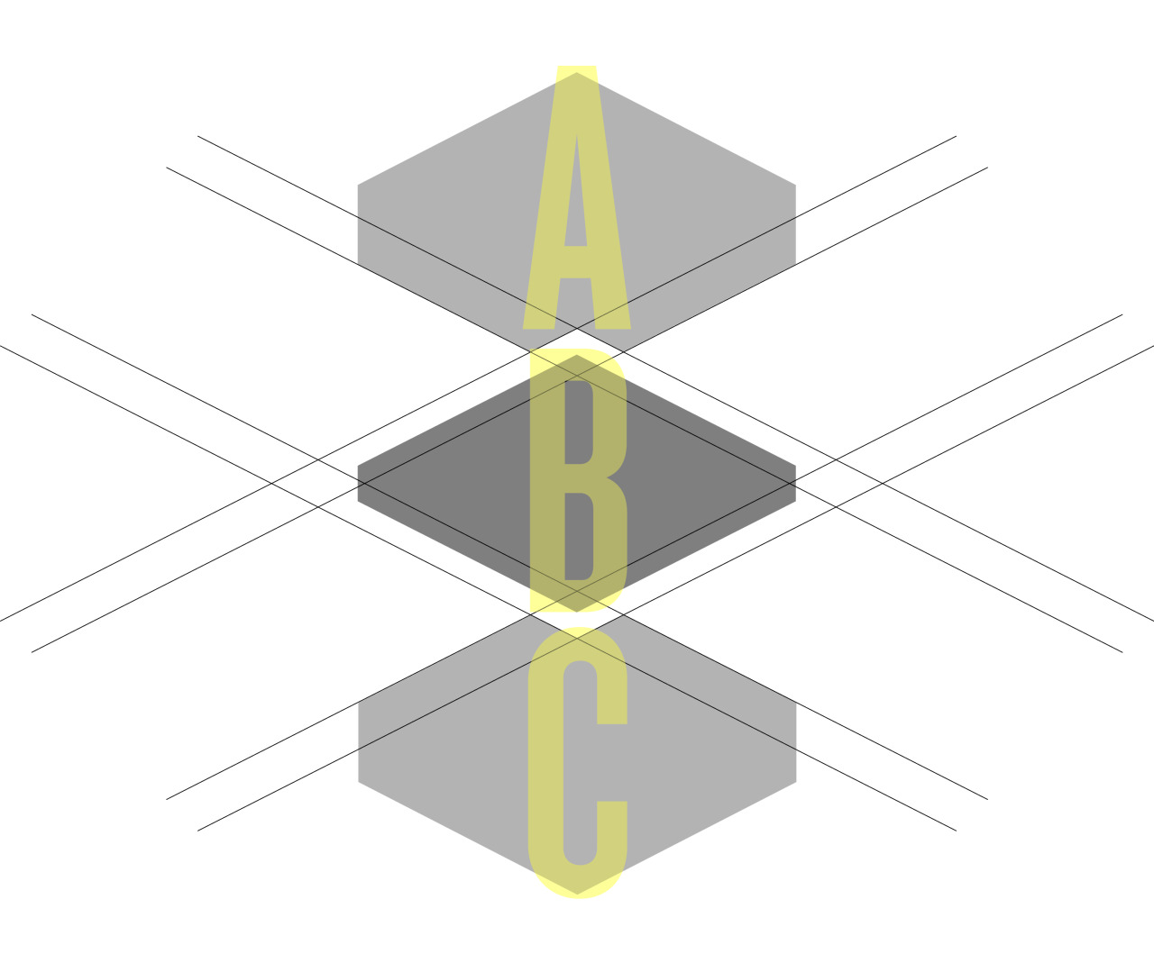
ABC
While working on a logo concept for a project at work, I started playing around with these geometric shapes. I liked their inherent puzzle nature (as they were derived from a compound shape and then broken apart), but I also found their edges and angles intriguing.
This is not perfect, but that’s okay. I am trying to push myself to be more creative and put more work up.


Highlights from Zahav | June 3, 2015
C & I went to Zahav last night and had a beautiful meal filled with flavor. As soon as we were seated I was immediately excited because we were right near a huge, open window - which meant that long-lasting natural summer light.
It was a phenomenal meal from start to finish. Everything was so carefully considered. All of the flavors worked to present interesting and complex dishes from start to finish. Service was impeccable and I even managed to snag some leftover Salatim for a snack.
What we ordered…
* denotes favorites (Spoiler alert: there are many)
Salatim (pictured)
House made Hummus with Laffa (pictured) *
Fried Cauliflower with labaneh with chive, dill, mint and garlic (pictured) *
Duck Hearts grapes, green tehina, pine nuts, ramp greens (pictured)
Cobia Crudot turkish salad, fava beans (pictured)
House Smoked Sable challah, fried egg, poppy
Sirloin Shishlik
eggplant caponata, babaganoush (pictured)
Lamb Merguez
garlic, english peas, rhubarb (pictured) *
Kataifi chocolate ganache, ricotta, hazelnuts
Coffee Custard hibiscus huckleberries, amaretti crumble *
This video shows the process and collection of covers that were designed (and presumably pitched) for the new novel Hausfrau.
I love this! I could have continued to watch for another 10 minutes.

Beautiful color combination.


The beautiful Production Design nominee slides used before the presentation of the award by Chris Pratt and Felicity Jones.

A Converted Tribeca Warehouse Brings the Outdoors In / Apartment Therapy
HOME GOALS.
“Chinatown is a Chinese translation of the trademarks in a graphical way.
It’s a carefully arranged series of artworks showcasing 20 well-known western brand logos with maintained visual and narrative continuity.
‘Chinatown’ pushes viewers to ask themselves what it means to see,
hear, and become fully aware. ‘Chinatown’ also demonstrates our strangeness
to 1.35 billion people in the world, when you can’t read Chinese.”
Fascinating. Be sure to click the link above to see more popular logos.

Pho (Well-Done Brisket) @ Pho 75 // 1.23.15


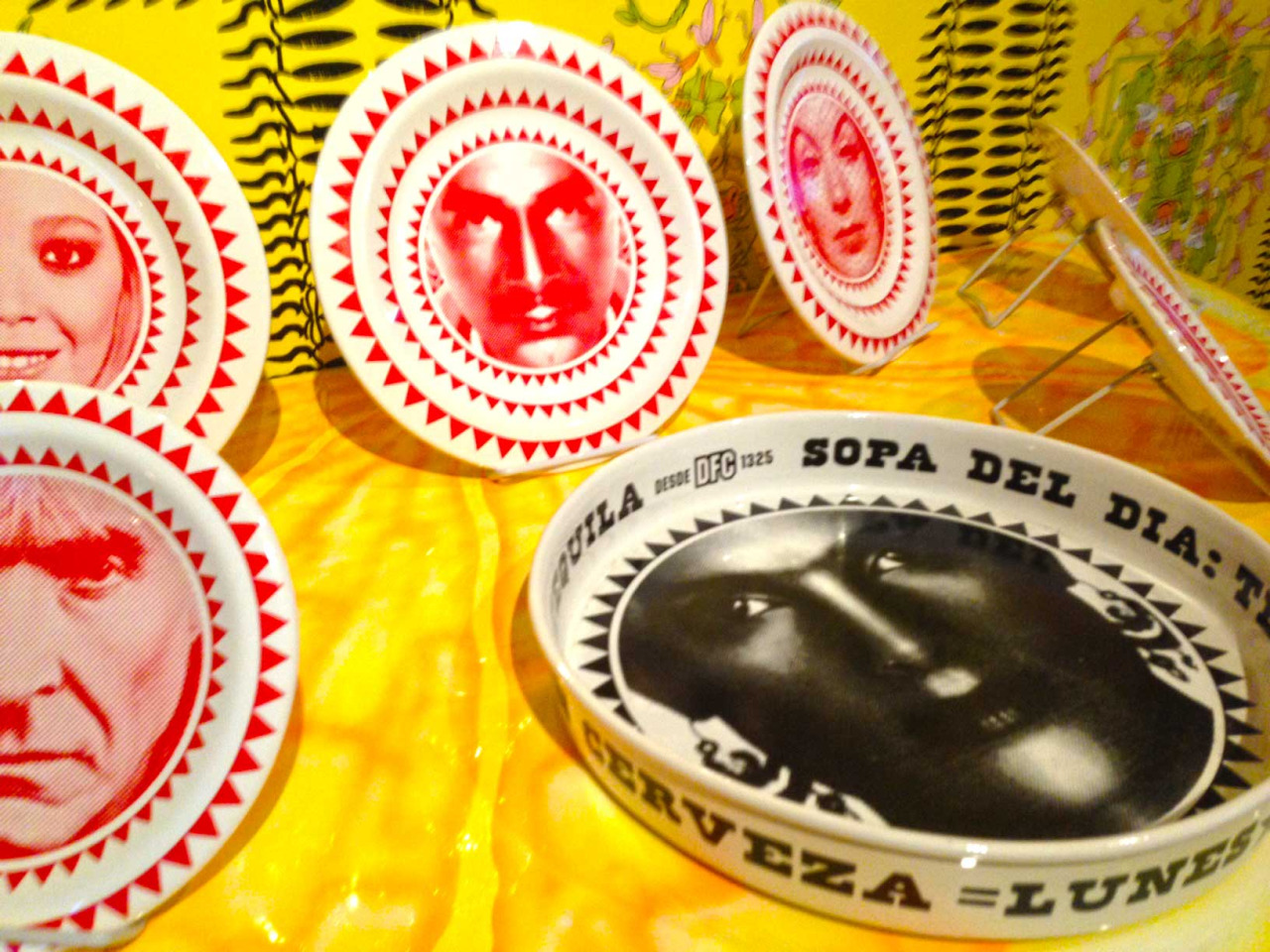

NYC / 1.16.15-1.18.15
I recently spent the weekend in NYC and had the chance to stop by the Museum of Arts & Design. The main exhibit is titled “New Territories”, which is subtitled “Laboratories for Design, Craft and Art in Latin America” - a terrific look into the emerging art world in a variety of Latin American cities.
Above are some highlights, my favorites being the shoe (surrounded by other innovative/weird shoes) and the large-scale 3D typography (made from interlocking postcard sized pieces of ephemera.)
The first photo was the rainy, foggy, gray view from my hotel room Sunday morning.




Best of 2014 (Movie posters / Album covers / Book covers)
Movie posters
Album covers
Book covers

Books I Read in 2014
Goal: 14
Total: 32
Memoirs: 7 (Let’s Pretend This Never Happened, Medium Raw, I Don’t Know What You Know Me From, Heat, Joan Rivers: I Hate Everyone Starting With Me, My Horizontal Life, Not That Kind of Girl)
Books with left-justified type in the upper left corner: 4 (In The Woods, Tenth of December, Not That Kind of Girl, An Object of Beauty)
“Classics”: 6 (The Importance of Being Earnest, The Glass Menagerie, Of Mice and Men, Our Town, The Stranger, Frankenstein)
Books written by authors who aren’t white men: 17 (Let’s Pretend This Never Happened, Dark Places, This Is How You Lose Her, In The Woods, I Don’t Know What You Know Me From, Harry Potter 1-5, Tell The Wolves I’m Home, Joan Rivers: I Hate Everyone Starting With Me, Where’d You Go Bernadette?, My Horizontal Life, Sharp Objects, Not That Kind of Girl, Frankenstein)
Favorites: In The Woods, Mr. Penumbra’s 24 Hour Bookstore, An Object of Beauty
Favorite covers: This Is How You Lose Her, In The Woods, Where’d You Go Bernadette, An Object of Beauty
What are some books you would recommend?
Lacoste - A L!VE pop-up story
This is just too cool. It really demonstrates just how much you can experience within a book. It pushes the senses, the constraints of book design, and takes user experience to a whole new level.
I can’t pick a favorite section/spread!