These are beautiful.
I love the illustration/watercolor style. Plus, who doesn’t love a quote about the wonderful and beautiful world we live in?

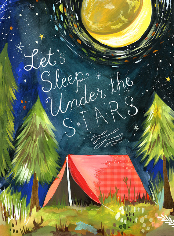
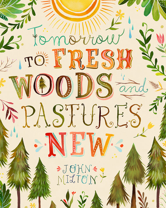


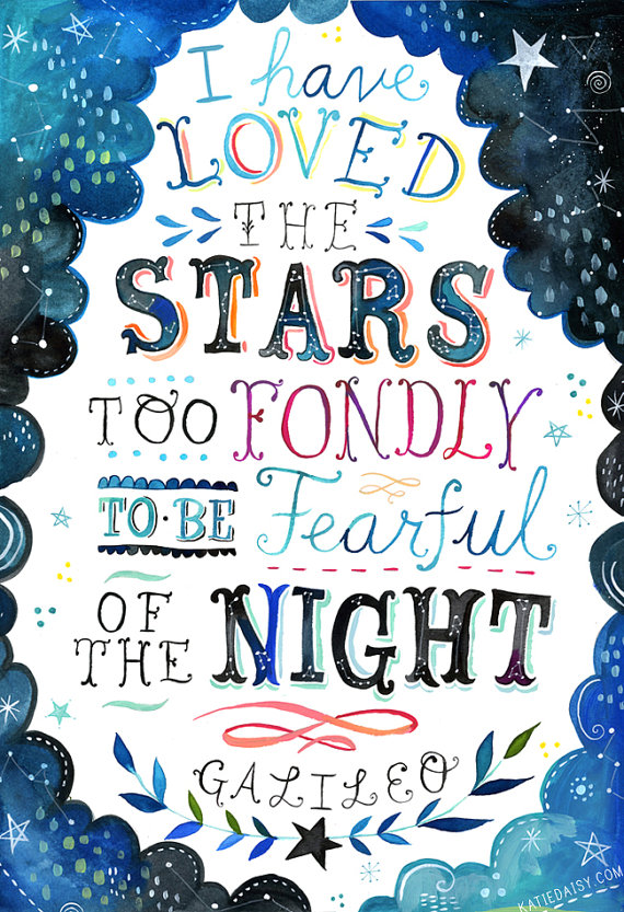

These are beautiful.
I love the illustration/watercolor style. Plus, who doesn’t love a quote about the wonderful and beautiful world we live in?
Best of Philly 2012 - Philadelphia Magazine
Great video showing the creation of the cover. Gibbs Connors & The Heads of State.
Rio 2016 Multisensory Paralympic Brand
Wonderful, interesting, and touching video about creating the logo/symbol for the 2016 Rio Paralympics.
Admittedly, I’m a sucker for sketches/process, but I think they’re process and sketches are exceptional.


Michael Scott Murray, Illustration + Design
Talented illustrator/designer who knows how to work both of his skills to their fullest potential.
These are two of my favorite.


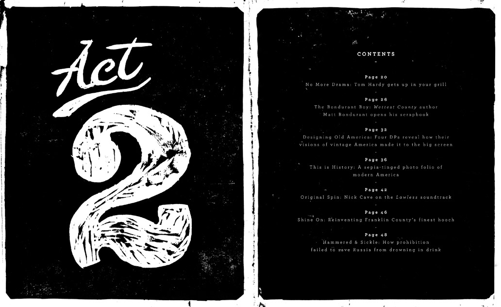
Love this whole layout. Illustration, layout, and typography are top-notch.


cqmy:
Narnia - Josip Kelava
I really dig this re-imagined cover for C.S. Lewis’ classic book(s). Josip Kelava did a great job of creating the perfect mix of emotion, mystery, magic, and wonder found in the books.
This commercial is the reason I want the car.
Admittedly, I’m not a car guy. I saw this commercial on TV the other day and was immediately interested. There are a number of reasons I responded to the commercial:
But what really drew me in is the discussion of process and perfection. As a creative thinker, the second anyone starts talking about process, sketching, ideas, brainstorming, revisions, or how something evolved from start to finish - I’m instantly hooked. The creators of this commercial use some sarcasm to play off “making a groundbreaking car… it’s that easy.” Yet, the audience (and fellow creative thinkers) know how accurate the depiction of the process is. The whole ‘sketch>sketch>revise>revise>edit>sketch>sketch>edit>design….’ process is my favorite part of designing.
So while this post is about a car commercial, it has nothing to do with the car they’re trying to sell me (although with strong promotion like this, Dodge clearly captured my attention.)

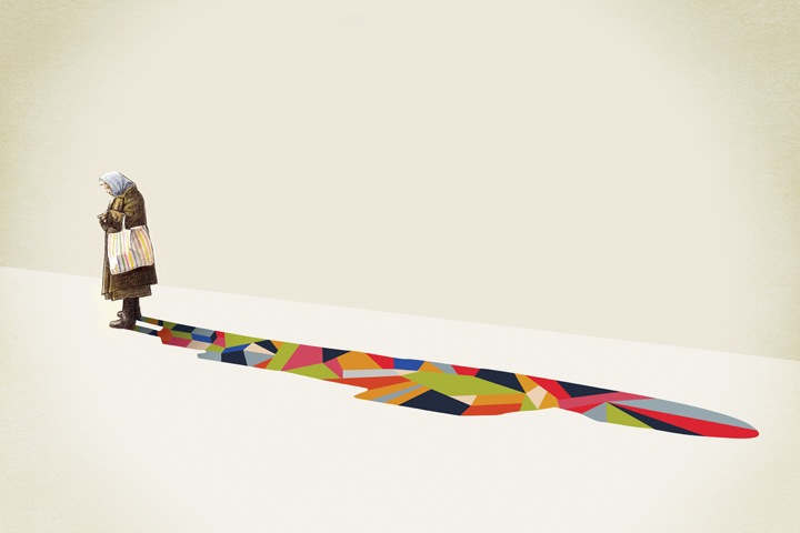


Walking Shadows by Jason Ratliff
Indianapolis artist Jason Ratliff creates a series of illustrations where he replaces the subjects dark shadows with colorful patterns. Check out the rest of the series on his site HERE
Love these.


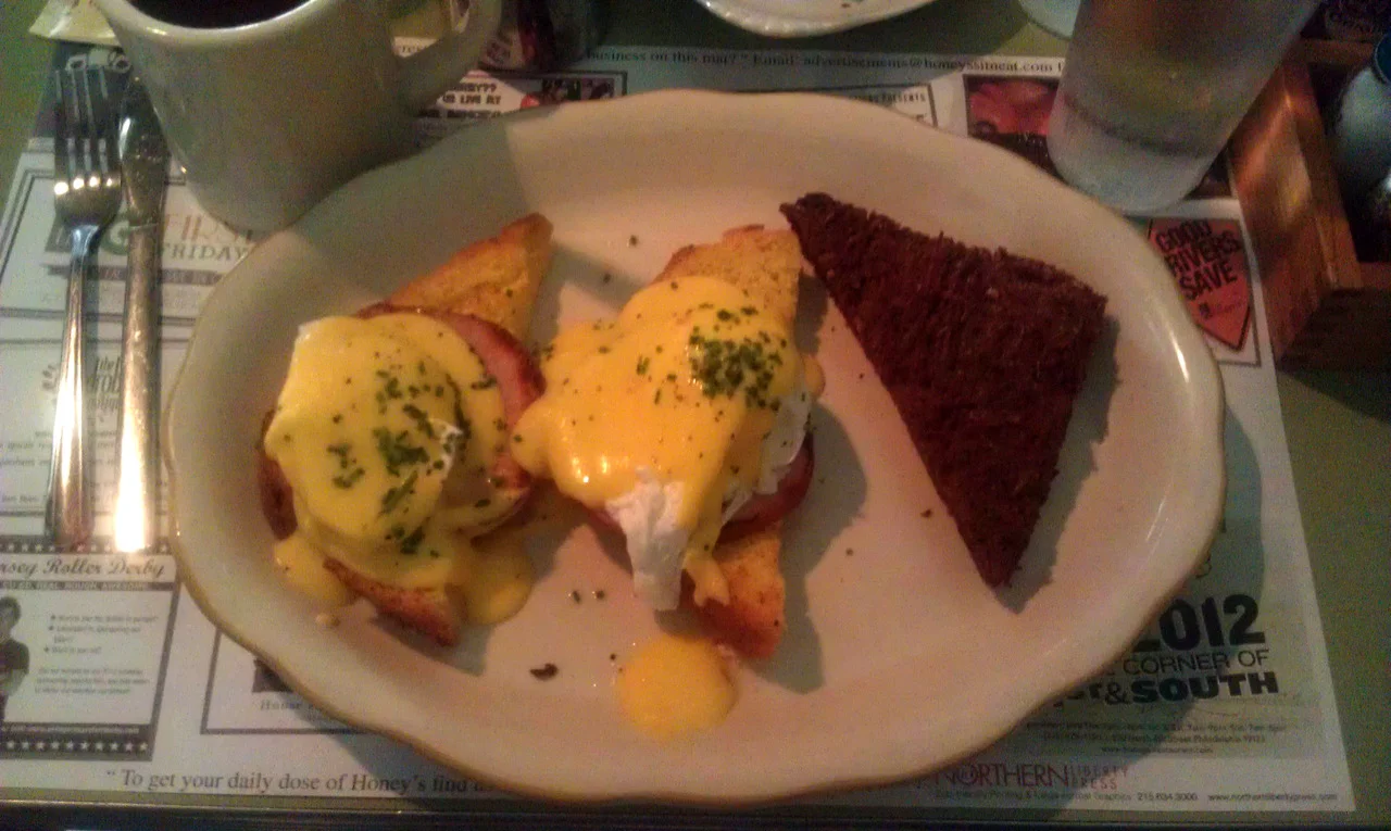


(all photos taken with cell phone, I apologize for lack of quality)
Exploring Philadelphia / Summer Brunch Project: Part 1
On the way to breakfast, we saw the current advertising campaign for Amstel Light. The ad seen above does a great job of combining infographics, advertisement, and brand awareness. I’ll definitely be paying attention to the Amstel Light ads I see around the city.
My friend Carlin and I went to brunch at Honey’s Sit and Eat earlier this week. I’ve heard great things about Honey’s, but always had been warned about the lengthy waits on the weekends. Going during the week is the way to go, if possible. We didn’t wait at all.
Carlin ordered one of the breakfast specials: Truffled Toad in a Hole. I ordered Eggs Benedict (on Challah instead of English Muffin), which came with a tasty Cheese + Onion Latke.
After Honey’s, we were walking around Northern Liberties, and found Architectural Antiques Exchange. Three sprawling, multi-room floors full of antiques ranging from chairs, typewriters, vintage signage/art, assorted iron pieces, fireplaces. Really anything you could imagine.


The Picture of Dorian Gray“You will always be fond of me. I represent to you all the sins you never had the courage to commit.”
One of my favorite books. It’s interesting to see the various covers chosen to represent Wilde’s work over the years and around the world.
If I had to pick a favorite, I’ll go with the peacock feathers.

Sea Legs
Inspired by The Shins’ song, “Sea Legs” - illustration from sketchbook, scanned and colored in Photoshop.

Lyrics from “Beth/Rest” by Bon Iver
Originally from February, I hand-drew typographic solutions to lyrics from “Beth/Rest.” I then scanned it in, and added some coloring to supplement the various hand-drawn typefaces.

My First Ambigram
I found this while at my parents house and thought I’d share…
I’m pretty sure I had drawn this doodle/ambigram while in art class in 10th grade. This was the height of The DaVinci Code and Angels & Demons hype, and through both novels, I had been exposed to the typographic work of John Langdon. Six years later, John Langdon would be my Advanced Typography professor.
Admittedly, this ambigram isn’t really successful, but I still think it’s an interesting doodle paired with the start of an interesting solution to my name.

Lynn Skordal - Medusa, 2011 Traditional Cut + Paste Collage
I really love this. The combination of images is really striking.


I should expect nothing less from two young, innovative designers who fell in love and are getting married. Their tremendously endearing and well-designed invitation, story, and background is worth the read/scroll. I love the simplicity of the layout and typography, letting the detailed flourishes and custom illustrations (created by the couple’s friends) do most of the heavy-lifting, design-wise.
Bravo! And nothing but the best of luck in marriage and life to the couple.

I updated my website to include some photos of the invitation (and program booklet cover) for the Drexel University Graphic Design Senior Show.
_________________________
I was asked by the Graphic Design faculty to design the materials for the Graphic Design 2012 Senior Show. This included: a self-mailing invitation, various web graphics, program booklet cover, assorted day of event posters, directional signage, and name plates. Using found scraps of screen prints, I created a collage in my sketchbook that I then scanned into the computer and dissected, reassembled, and manipulated. I wanted the look and feel of all of the materials to showcase the power of color and design more image-based work than typographic (as seen in previous years’ invitations.)